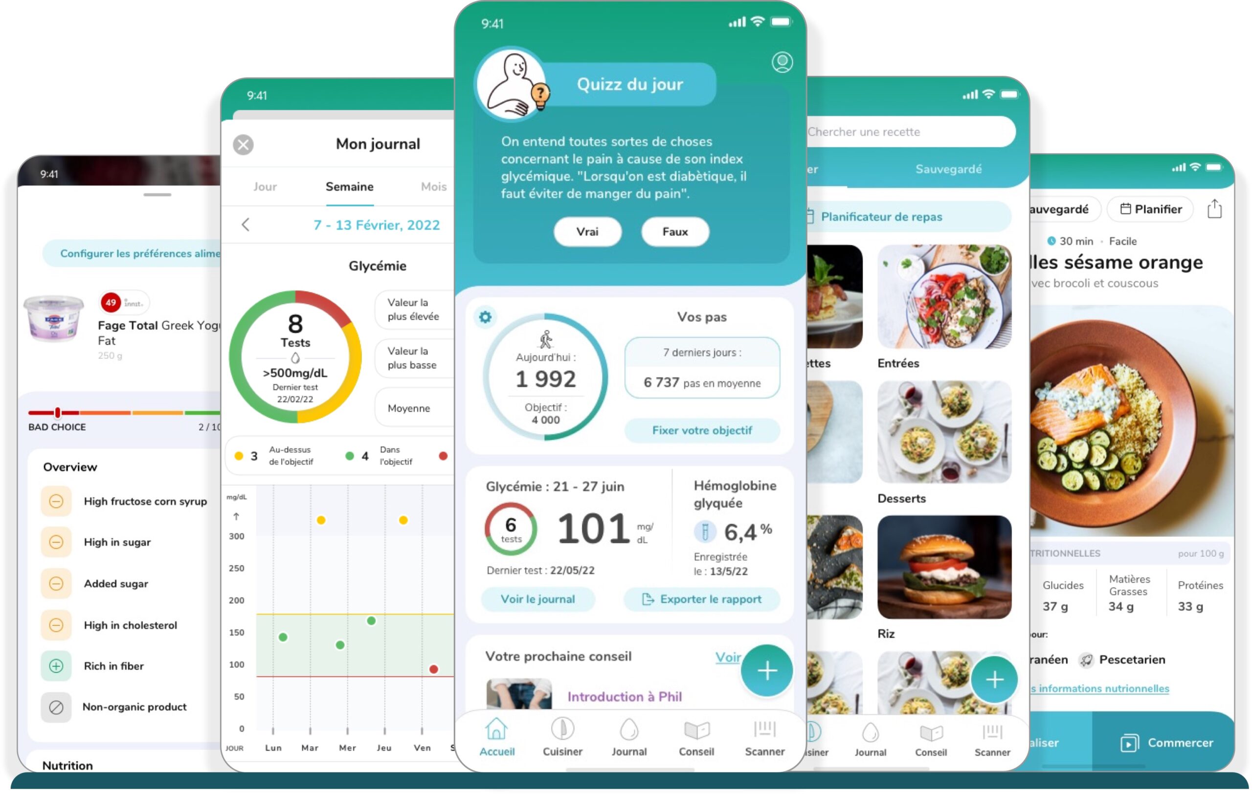
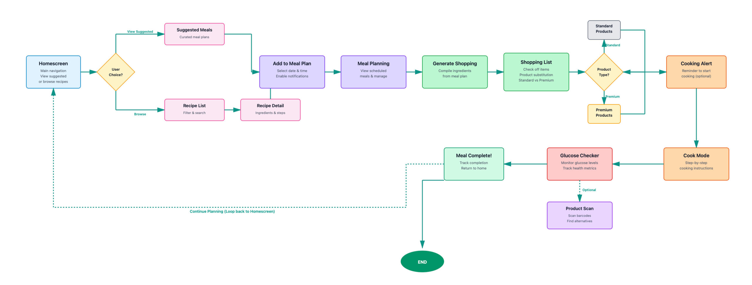
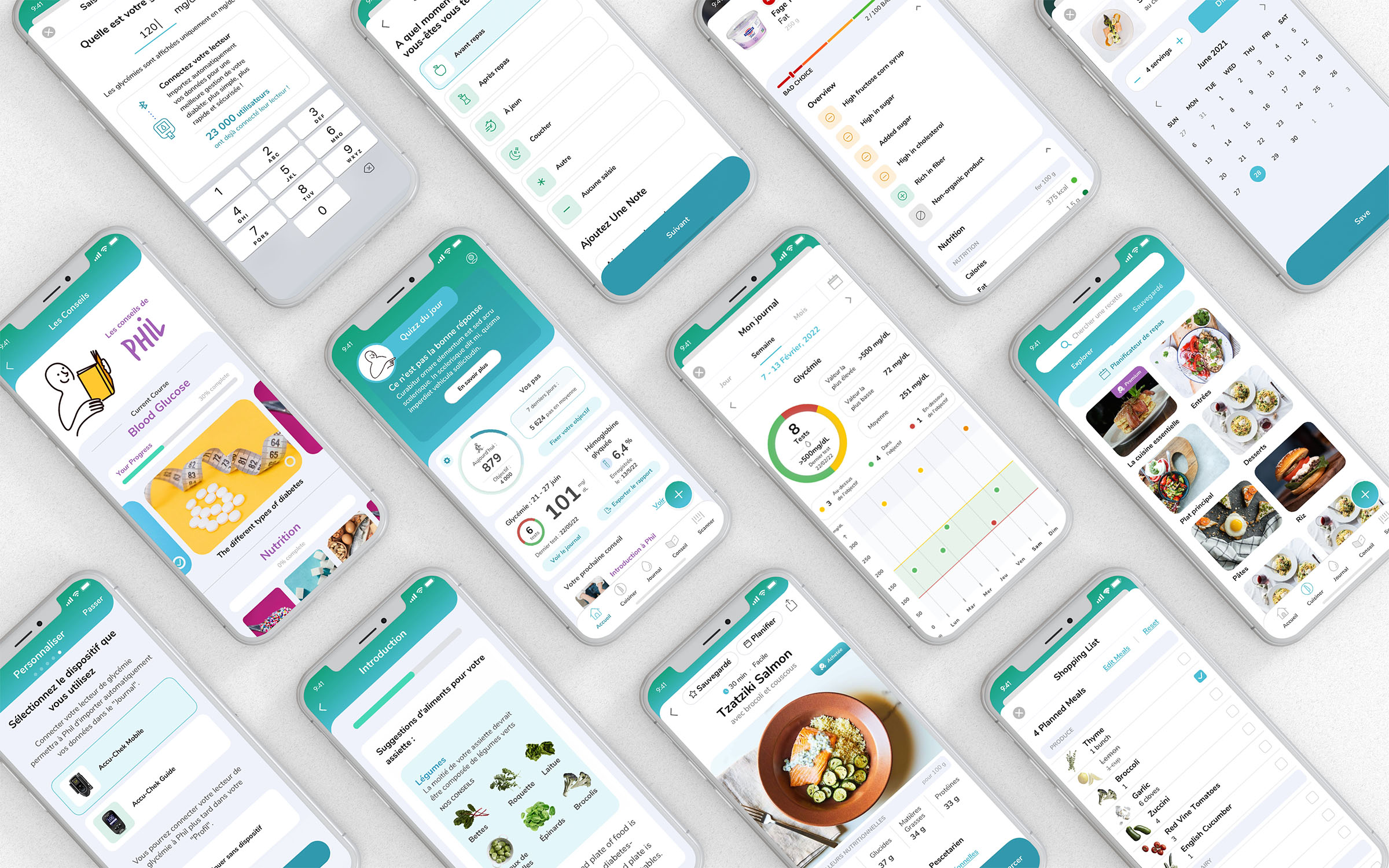
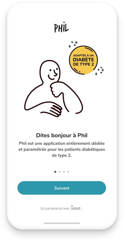
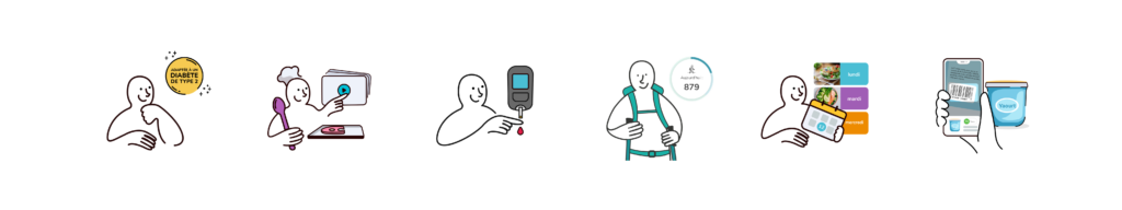
Phil is a mobile app developed for Roche Pharmaceuticals in France that helps people with Type 2 diabetes manage daily life through personalized recipes, meal planning, grocery integration, product scanning, activity tracking, blood glucose monitoring and health reporting. It has since become the leading Type 2 diabetes app in the French market.
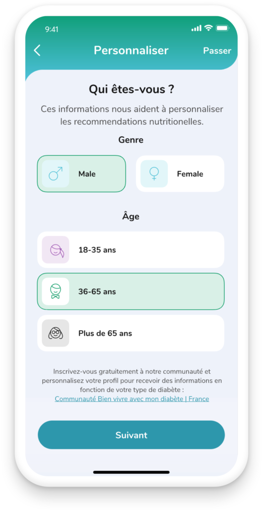
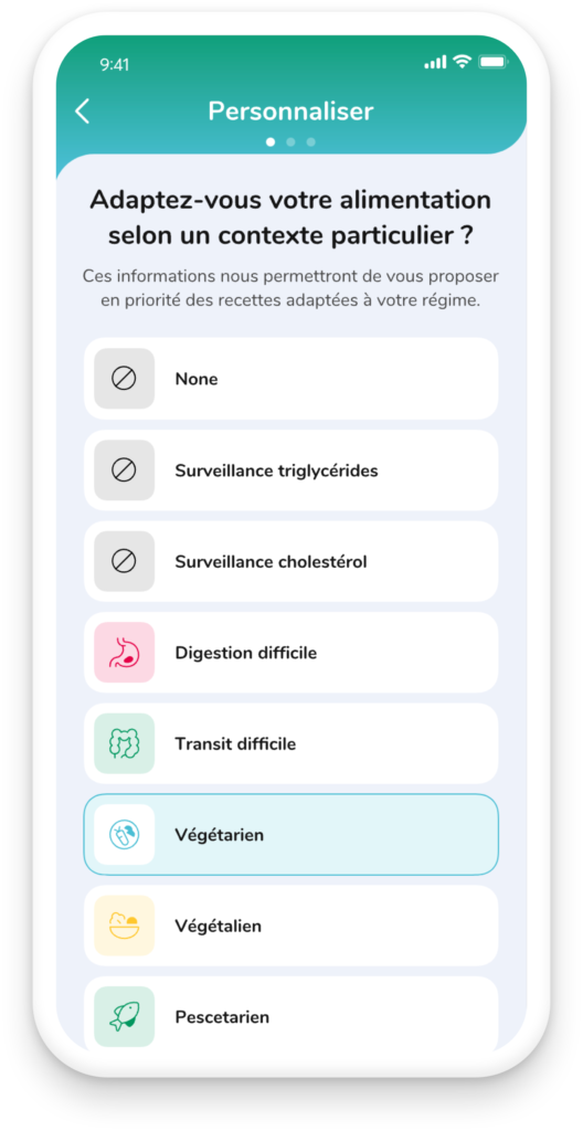
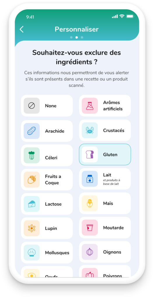
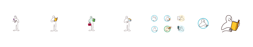
I lead UI and UX design across the entire experience, from onboarding and recipe flows to the scanner, glucose tracking, Diabetes Journal and report export. Working closely with Roche product managers, clinicians, and engineers, I translated complex health requirements into a clear, patient-friendly design system.